Sunday, July 19, 2020

Sizzix Holiday Village with Oxide background

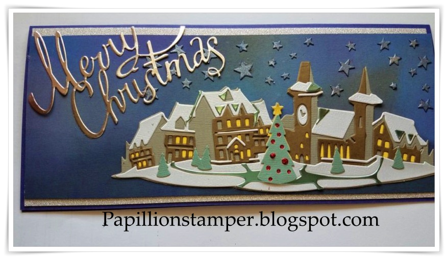
Hi Everyone! Today I'm sharing one of my first attempts with the 2020 Sizzix Holiday Village Die #664737 by Tim Holtz.  I have two versions to show you basically created the same way. 

A couple of tips.  These dies are easy to use, there is a Sizzix video to help you know what order to put the items together and how the colors look.  I would suggest you watch that it might save you some frustration. Here is the link: https://www.bing.com/videos/search?q=Tim+Holtz+holiday+village+video&docid=608045417756492928&mid=CC9EB480D719B0183C6CCC9EB480D719B0183C6C&view=detail&FORM=VIRE .

This die is surprisingly easy to assemble, even though it is a little time consuming.  There are some tools I felt really helped me with my assembly.  First, if you have a way to make your card stock with a sticky back, I would suggest you do this.  Tim Holtz Scrapbook.com ,Couture Creations (the one I use) and Ken Oliver all have versions of this product.  If not, you need a glue you can put on small, fine, tiny pieces.  Second, I would suggest a pair of tweezers.  The tweezers were handy to "nudge" my little windows into place and pick up those tiny strips like the one above the door.  Even with my fat fingers and arthritis I was able to get it together.  Next a craft pick, pokey tool, or something to push the paper from the dies.  When I cut them from scrap paper without the pieces fell out easily, but once I cut adhesive backed paper in I had to push them out.  I didn't mind this, because it mean I didn't lose any of those tiny windows. Finally either a bowl or paper plate is handy to put all of the pieces onto as you push them out.  Little tiny pieces have ways of sticking to clothes or flying off even the most organized space.

Each die has the suggested color to use for the pieces.  For this first card I used Tim Holtz paper for all of the paper except the purple and the white. 


 Once you cut your pieces you are ready to begin assembly.  Just follow the layers as described in the video.  I would suggest for the windows, that you lay them out before you glue them, especially the first time. 

Once I had the village together I was able to create my background.  I started with a purple cardstock.  Then I layered Oxide inks in Fossilized Amber, Blueprint Sketch, Wilted Violet and Black soot.  You can see I didn't go too heavy on any one color. 


I placed my village on top and decided I needed a little something in the sky.  I had a piece of Navy blue cardstock that I had sprayed with Brushed Pewter Distress Stain to try as a background.  I cut it using the Sizzix Die #663095 Swirling Stars and then glued the starts onto the background.  I layered my purple cardstock on a piece of silver glitter cardstock and then on a base card from purple.  I cut Merry Christmas from Sizzix #664196 Christmas Ribbon, using Tim Holtz Metallic Cardstock.  I also added red stickles to the tree for the bulbs.  


The second card I used the same inks for the backgrounds, but I blended them directly on my white base card.  All of the papers for this card were from my scrap bin. I cut the Christmas tree twice so that the balls would be red instead of yellow.  I also cut the top of the tree out of silver metallic so I could have a silver star.  It's a little brighter but I like it.  Instead of the stars for this card I cut Santa and his reindeer from brown and navy cardstock and then layered them.  I also added some silver to the sled rails using a Nuvo Glitter pen as well as the collars of the reindeer.  You can't see it but I also added some gold Nuvo to the reins.  These look much more intricate that than they actually are; I will be making many more for my friends for the holidays.  I hope you have time to get a little ink on your fingers today. 


Tuesday, July 14, 2020

Time to Get Organized - Swatching my Distress Ink Products

Hello and welcome to a stay inside and stay cool summertime project. 

It's over 94 here today and promises to get hotter and muggier as the week goes on.  Why not make the most of my time inside to get my Distress Ink products sampled and organized? I had already made swatches for my glazes on a tag.  But that was just one product. 

I had the print outs from Ranger Ink for my ink pads- how could I get swatches of all of my products?
l was certain that this would help me keep track of my inks and allow me to compare colors before I put them on a future project.  Creating swatches was something Tim Holtz reiterated over and over again during his Spring 2020 videos, so I decided to give it a try. 

My predicament was first, what kind of paper I wanted to use? Second, how to make it cost effective? I use mixed media heavy stock most frequently for my project, but it isn't readily available in my area.  Most importantly , this would not have been a cost effective method to swatch all of the distress inks, sprays , crayons, glazes and paints.  I also use Dyan Reavley's journals (I often cut the paper our of the journals to use) so when I found the creative flip journals on sale a light bulb came on!  Why not use the pages from those journals and put all of my products on one page?  I have to say the results were better than expected.  Now I can see the sprays, inks, crayons, paint and glazes all on one page. 

I am pleased with the outcome.   I used the printed labels from Ranger's website to label each page.  Then I decided to put the Spray Stain at the top.  A stencil made from chipboard gave me the rectangle  so it didn't just go all over the page. I used my splatter box.  I cut a piece of chipboard the slightly larger than the page so I didn't have to cover other parts every time.  Then I used a circle punch to create two circles for the oxide inks.  I used one of the stamps to stamp the Distress and Oxide inks as well.  I think that many of the inks look different when stamped rather than on a blending tool.  On the third row I placed a scribble of crayon twice.  The first, on the left side is straight crayon to paper, the second one I smudged with my finger which had a little water on it.  I wanted to see how the crayon would look if I used it as a watercolor.  Next I dabbed a little paint and finally on that row the glaze (if available).  Finally at the bottom I used my second rectangle stencil for the Oxide spray. It was easier to make a second template that fit the bottom than reusing the top one.  

A couple of tips if anyone decides to mimic this approach.  First, make sure one medium is dry before you place the second one so you don't smudge.  Second, when I sprayed I made a concerted effort to spray from the same height and angle and the same number of pumps.  I purposely did NOT remove any of the splotches from the sprays.  Sometimes I want those so I thought it was good to see how they would look.  Finally, make sure that your inks are dry before you use your glaze unless you want some of your ink embossed.  Later I thought I probably should have done a few water drops on the oxide ink to see it oxidize but I think I can imagine what that outcome might be.  

This was a great way for me to rediscover colors and really look at how the intensity varied between the two sprays and the inks.  It also gave me a really good inventory of what I was missing.  Now, I will remove the pages from the journals and put them on rings.  I considered leaving them in the journals but I want to be able to compare colors side by side. I wrote what each item was with my Pitt Pen. 

Now, before someone asks...why aren't the markers on here? Well I have the markers, but I don't use them very often and they are being phased out.  I could always add them later but for now I'll leave them off. 

Here is the link on the Ranger page for the labels https://rangerink.com/pages/organize-your-ranger-products.  

I think this will become a valuable tool for me.  It is expandable as colors are added and gives me a true picture of how the mediums differ on the same paper.  By the way, the Picket Fence will be on black.  Later I may add all of them on black, for now I'm happy. 

I hope you have time today to get some ink on your fingers! Take care - Pamela 


Thursday, July 2, 2020

A Celebration of Independence and Freedom

Today I wanted to share with you a vignette box I made to celebrate the 4th of July. 

The idea behind this scene is the man on the suitcase has just arrived to town and is waiting on his cab.  He is sitting on his trunk in front of a building that has been painted for the 4th of July. A parade has gone by and the remnants of the parade are still hanging on and all over the street.  The others are watching that last of the parade go by. 
Here is how I created my scene; a list of the supplies is at the end of this post. 

First I painted the box with Distress Paint in Weathered wood.  Even though you can't see the sides and the back I like to have it finished.  Next I covered the back of the box with Typeset tissue paper using Collage medium. I sat that aside to dry.

While I waited I pulled out some old idea-ology paper and cut the word America.  I inked the edges with black soot and put some small white marks to highlight the letters with a pen.  Then I cut the Old Jalopy BIGZ die 4 times   I cut one each from brown, metallic silver, black and the section of the doors in woodgrain paper.  I inked the car with Vintage Photo and Walnut Stain Distress ink.  I layered the pieces to create the cab.  I had to freehand the woodgrain paper to create the doors and the silver for the headlight.  You can't really see it but I also used some clear plastic on the windows.  


Then I colored the paper dolls.  I used distress crayons and also speckled blue embossing glaze.  

I die cut the suitcase from cracked leather cardstock and metallic for the buckles.  I inked the cases with Shabby Shutters distress ink and then embossed it with the glaze in the same color.  Inked the straps with Vintage photo Distress Ink.  I used a black soot crayon to outline the suit case just a bit.  

Next, I used the Impresslits folder Star Trim to create my frame.  I cut it from silver metallic paper and then I used alcohol ink to tint the trim and give it a little age.  While those were drying I went back to my background.  I applied crackle modeling paste through the stencil on the left. I dried it partially with the heat tool and then I let it sit overnight.  I find that with crackle paste a long natural dry time works best for me. Then I died some mica flakes with Poppy Red and Monsoon alcohol inks.  Those dried overnight as well.

When I returned the next evening, I used my Distress crayon in Faded Jeans to create the blue over and around the stars.  Next using the Barn Door Distress crayon I created a border around my edges and then faux stripes using a ruler.  I smudged the crayon with my finger which was damp.  Then I took a permanent pen and wrote the words to part of the Pledge of Allegiance between the stripes (I covered it up later but I know it is there and it peeks out in places) . 


I painted the pole for my flag and the star with Brushed Pewter Distress paint.  When that was dry I glued the flag to the left edge of the box.  I manipulated the flag to create the folds and secured that with some glue dots.   

Then I coated the bottom of the box with collage medium and sprinkled the mica flakes on there.  I added some that I had not died to create red , white and blue confetti, like a ticker tape parade.  I also used some collage medium in spots to sprinkle some of the confetti so it looked like it was caught as it rained down from the buildings above.  

I used score tape to adhere the Impresslits star trim.  Then I layered in my scene using collage medium and foam tape to create the depth for the scene. 

I hope you get time to enjoy some time to celebrate this wonderful country this weekend with your friends and family and perhaps find some time to get some ink on your fingers.

Until next time- Happy 4th - Pamela 
--------------------------------------------------------
Supplies:

 Paper- Tim Holtz Metallic 3, Classic , Woodgrain and Cracked Leather cardstock
Tissue Paper- Typeset
Distress Inks:  Peeled Pain, Vintage Photo Black Soot, Antique Linen, Walnut Stain, Peeled Paint.
Sizzix BigZ die Baggage Claim  # 664439; Impresslits folder- Star Trim # 663297 and Old Jalopy
Tim Holtz Distress Mica Flakes
Ranger Alcohol Inks : Poppy Red, Monsoon, and Mushroom 
Distress Crayons- Bard door, Faded Jeans, Worn Lipstick, Aged Mahgony, Fossilized Amber
Distress Paint- Weathered Wood and Brushed Pewter
Tim Holtz Idea-ology Paper Dolls 
Adhesives: Scor-tape, Distress Collage Medium, Golden crackle paste
Idea-ology Adornments - Star
Flag- Hobby Lobby


Wednesday, June 10, 2020

For the Birds

Hello Everyone!

Today I'm sharing a little house that I made using a Tim Holtz Vignette box and a lot of Tim Holtz Distress, Idea-ology, Ranger and Sizzix products.  I love these little boxes to create a scene.  This one is "For the Birds".  The little bird has taken over this little house!


I started by spraying the box with Distress Spray Stain with Walnut Stain.  I then layered the Speckled Egg Stain on top. I forgot that the first stain would be reactivated by the second one, but I like the outcome.  It look like aged barn wood.  

I cut two pieces of the Worn Wallpaper from Ranger Idea-ology and inked the edges with Vintage Photo.  I glued them in the bottom and the top of the box.   I used the smallest of the Baseboard Frames to frame the ephemera piece from the Field Notes Collection.  Before gluing the bird to the frame I rubbed the frame with a little bit of Vintage Photo one the frame.  

I sprayed a piece of cheesecloth (from the paint department of the hardware store) with Speckled Egg and Vintage photo spray stain and set that aside to dry.  Meanwhile, I covered one of the small corked vials from Idea-ology with texture paste.  Because I used the crazed texture I allowed it to dry naturally.  I sprayed some of the flowers from Idea-ology Bouquet with Speckled Egg Spray Stain.  I sat those aside to dry.  Then I used various alcohol inks to color some of the baubles and heirloom roses (also from Idea-ology).  

While my small pieces were drying, I misted some mixed media heavy stock from Ranger lightly with water and then used my Sizzix Impresslit folder (Sizzix 662768) to cut three pieces.  The folder is called mini-provincial.   I then dried them with the heat tool.  I used an embossing dauber to cover the pieces with Distress Antique Linen embossing glaze (I love this stuff). Next I rubbed some of my walnut stain crayon across the top.  It was a bit dark so I wet my finder to move it around a bit and push it into the crevices.  Next I used my finger to rub a little bit of Distress paint in Speckled Egg across the embossed pieces.  I cut them to fit and glued them on the box. The scale of this impresslit folder is perfect for these vignette boxes.

I went back to my corked vial and rubbed it some Vintage photo pain and let that dry.  I didn't really think it looked like I hoped, so I put some Distress Paint in Speckled egg on top of that.  I used a file to pull sand off some of it so the white would poke through.  Then I glued the flowers into the vial and added a piece of string around the top of the bottle.    

I placed excelsior in the top of shelf with a little bird and a nest from my stash.  I wanted it to look a little messy so I let it hang out a bit.  I added a bit of moss under the bird too (here is a little close up)

Moving to the lower level I glued the frame into the back wall of the house.  I placed  the colored cheesecloth into the corner and glued that into place. I pulled a gear from my stash and laid that in front of it and glued it in place.  It reminds me of a wagon wheel.  I placed moss in the bottom of the box and secured it in place.  I prefer to use different colors to give it some texture.  I put my corked vial in the corner and put a little more moss around it.  Next I took one of the Tim Holtz thimbles and turned it upside down.  I didn't want to use a bunch of baubles to stack inside so I cut a circle wide enough to cover the opening and glued that on top.  I then glued the baubles on top  I then placed the heirloom roses in the grass. 

I colored the paper dolls using Distress Crayons in Dusty Concord and Picked Raspberry.  I colored their cheeks with aged mahogany.  I learned this technique from Paula Cheney and her blog One Lucky Day.  She is fantastic at working with the paper dolls (oneluckyday.net).

I used a typed tag and a nail head both from Idea-ology and glued that to the side.  Finally, I added two butterflies to the top of the house in the moss.   

I really enjoyed watching my little house come together.  I think my bird will be very cozy.  Thanks for looking - I hope you have time to get some ink on your fingers today! Pamela 

Sunday, June 7, 2020

Distress Crayon Tag

I hope all of you are having a great weekend.  Today I'm sharing a tag I made after watching the Q&A on Distress Crayons with Tim Holtz on 6 June 2020.  I have to admit---I had the crayons but didn't use them very often.  However, after watching this tutorial I'm sure I'll get a lot more use out of them. 

So I started with a tag covered in  Collage medium.  While the tag was still wet I added ephemera from the Idea-ology Field Notes collection and some words from the Big Chat pad from Idea-ology.  I covered those with collage medium as well. I didn't need a thick covering, just enough to keep the edges down.  Then I added crayons to the card in the negative spaces.  I used Distress Crayons in Weathered Wood, Dusty Concord, Seedless Preserves, and Fossilized Amber.  I blended them with my finger until I was happy.  Next, I used the stencil TH143 to add some ink in a couple of places.  I used Worn Lipstick Oxide Ink.  I heat set it to be sure it had set before I moved on..  It is very faint.   Next, using Tim Holtz Stencil TH130 I removed some of the crayon using a damp paper towel.  This stencil resembles splotches...I really like it.  I still felt like I needed something else so I pulled out CMS396 (Field Notes) stamp set from Stamper's Anonymous and added the label and figure numbers with Ranger Black Archival ink.  

I splattered drops using my Ranger Splatter brush and Ground Expresso Spray Stain and dried it with my heat tool.

Finally, I inked the edges with some Black Soot Distress Ink just to finish it off.  I added a piece of velvet ribbon just to dress it up. 

I really enjoyed the tutorial and I look forward to making more projects using my Distress Crayons.  You can view the entire tutorial here: https://tim.holtz.com/blog  look for the Q&A Demo: Distress Crayons. 

I hope you have a chance to get a little ink on your fingers today.  Stay Well!  Pamela 

Friday, June 5, 2020

Taylored Expressions Cards from Dog Lover's Release

Happy Friday, I'm sharing two cards I made using the Taylored Expressions latest release for 2020. This release has a dog them something that appeals to everyone. The release includes stamp sets, coordinating dies and a stencil. The stencil is where I put my focus for these two cards.

This first card I used a texture crackle paste from Ranger through the stencil.  I didn't put it on two thick and then I let  it air dry.  You can't really tell in this photo but the little crackles in the paw prints really add some texture to the card.  Then I used Vintage Photo Distress Ink from Tim Holtz to add color.  I purposely left some places lighter than others.  Then I die cut the little dogs out of brown card stock.  Finally, I stamped the saying with Black Ranger Archival Ink.  These are strip sentiments and there is a coordinating die as well.  I really like how quick it is to stamp a bunch of sayings and then die cut them. There are a variety of sentiments for different occasions. I layered the card on a patterened paper and then another layer of medium brown before putting it on the dark brown card.  The finished side is 5 1/2 X  5 1/2.  

The second card I used modeling paste in the stencil.  Again, I didn't use too much and I let it air dry.  Then I used Distress Inks in Pickled Raspberry to color the back ground.  I also used Festive Berries along the edges just to give it some depth.  Then I die cut the dogs twice, one in black and one in pink. There is also a die with larger dog breeds, but because I am Mom to a Sassy little Shih-Tzu I was drawn to the smaller breeds.  I layered my pink piece on some patterned paper from JilliBean.  I used foam dots to raise the pink puppies on the first row.  Next I  took one of the sentiments from the Sentiment strip and layered that on a piece of paper that I cut to resemble a pennant.  I think any lady young or old would love to get this card.  

You can find all of the stamps and dies I used here: 


If you have questions just leave me a comment below! I hope you find time to get some ink on your fingers today!  Pamela 

Monday, June 1, 2020

Resist Technique using Distress Paint

Today I'm  presenting a project recently demonstrated by the fabulous Mr. Tim Holtz.   I would highly encourage you to watch this video.  Here is the link:  https://timholtz.com/qa-demo-distress-paint/?fbclid=IwAR2HURxqBerwFkRtgUvVxK2_D-cyKZxVUoVOlg-M_Yv4_UszUbYhAXEcDaM

This was my process for this tag.  I started with a mixed media heavy stock tag from Ranger. I find the heavy stock stands up well to water.  If you don't have a tag or mixed media heavy stock you can use thicker card stock. You can use watercolor paper as well, but you will get a slightly different outcome 

I used Stampers Anonymous CMS106 to stamp the text background on the tag using paint-- not ink!  You can put the paint on the stamp using a brayer or a sponge. If you don't have that stamp any text or graphic background would do.  I dried the paint with my heat tool.  Next I layered different colors of ink and blended them.  Normally I choose three inks...this time I was brave and used Distress Ink in Vintage Photo, Shabby Shutters, Fossilized Amber, Tumbled Glass, Broken China , Abandoned Coral and Peeled paint.  Just use what you have and what you like and go for it. 

Once I was pleased with the ink I put some water droplets on there and then dried it. Notice I didn't say "mist"  I wanted big droplets so I used my fingers in some water.  You can use a paper towel if you get too much.  You can also use the Tim Holtz Distress Sprayer which does both mist and droplets. Confession- I couldn't find mine so I stuck my fingers in a glass of water on my table- it got the job done.

Next using  Tim Holtz Stencils THS090 and THS004, I used some picket fence paint through the stencil using a sponge.  A sponge dauber can be used and rinsed and used again.  I like a makeup sponge. You could also use a stencil brush, whichever you prefer.   Don't use too much paint so it doesn't seep underneath.  Then I dried the paint.  You can always let it air dry too, it dries fairly quickly.  If I were doing several backgrounds I probably would not dry it with heat. 

For my next step, I inked up the balloon and the gears from Stamper's Anonymous  CMS 130 in black Archival ink and stamped the tag.  Then vibrancy of the Archival ink really stands out against the background.   Then I used  Stamper's Anonymous CMS 397 and put just bits of text randomly on the tag. You don't wan the entire stamp.  

I went over the edges with my vintage photo ink pad just to darken them up a bit.  Finally, I used my splatter brush to splatter some speckled egg paint on the tag.  

I hope you take some time today to get a little ink on your fingers! 

Pamela